Identity & Multi-platform Design for Solcharge
With the rise in electric vehicles, the demand for charging stations grew. This need led to the development of a solar-powered electric car charging station’s visual identity and branding. Solar power is 100% clean, renewable energy that can power your electric vehicle and can be more cost efficient than gas per gallon and charge through electricity from utility companies.
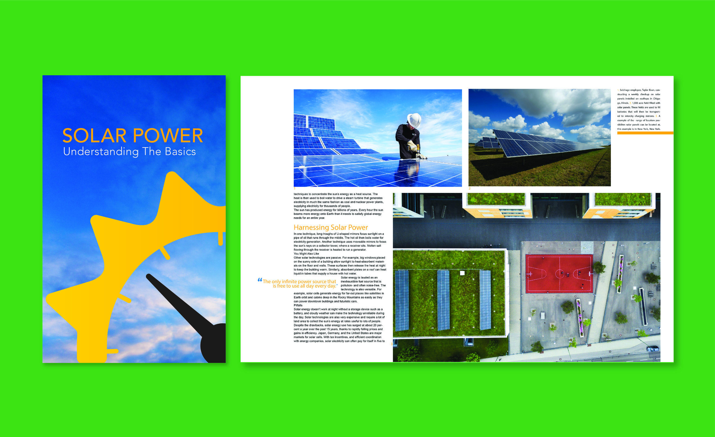
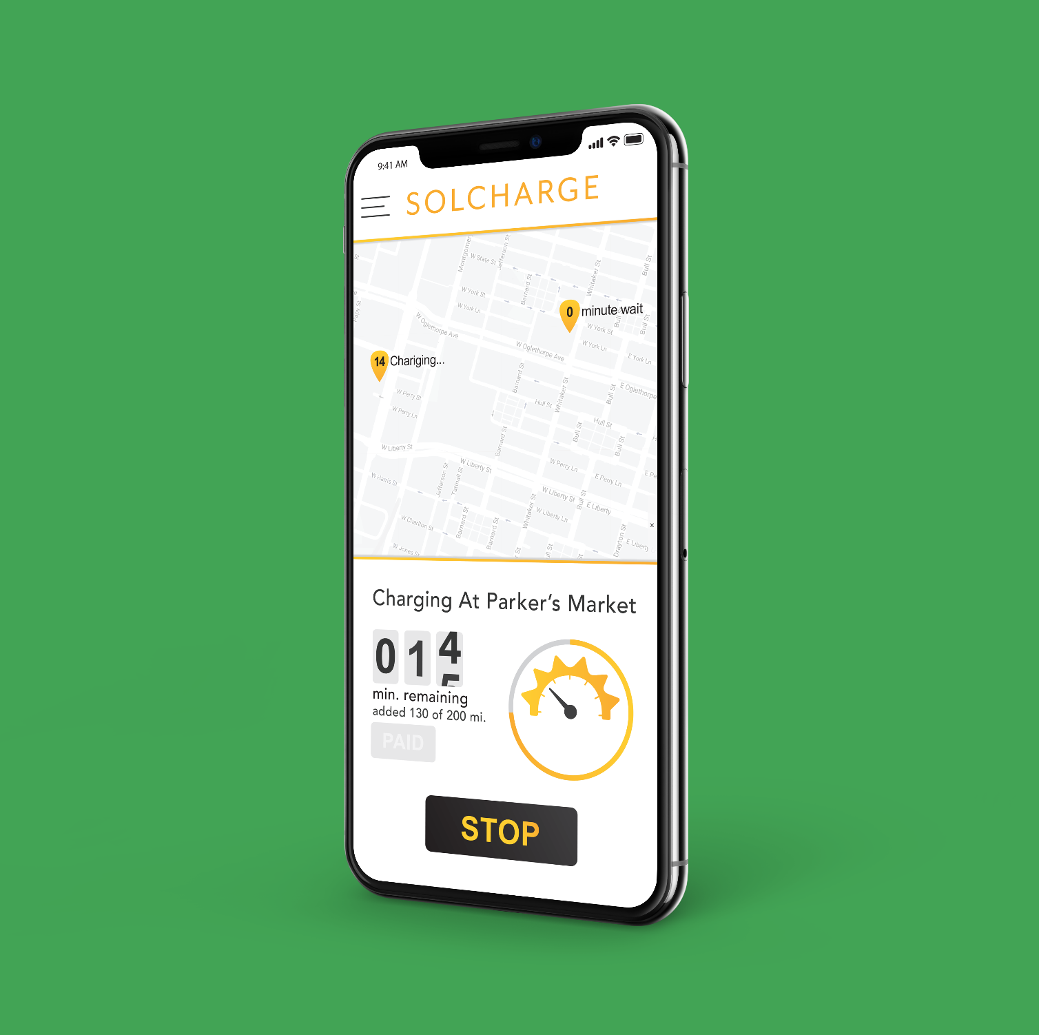
The development of the brand identity began with research of the industry and common visuals that relate to solar, vehicles and eco-friendly. From there came the creation of the brand’s trademark that visually referenced the idea of solar power and motor vehicles. This was done by integrating the optical idea of a sun with a gas gauge. The finished trademark became widely and quickly understandable by taking the familiar circle of a gas gauge’s outer curve and mimic the visual interpretation of rays from the sun. From there the name “Solcharge” was developed by conjoining Sol, to reference the solar power, and Charge, referencing the vehicle charging.
After the development of Solcharge’s trademark and logotype, came the production of the spoken and written tone. To assist the consumers in understanding Solcharge and increasing brand awareness, terminology that described and complemented the idea of the sun was used throughout advertising and branding materials. For the visual style of the advertising and branding materials the same concept was used, of increasing brand awareness by using complimentary items of the sun, these visuals included sky imagery during all times of day and night along with juxtaposing the trademark into the horizon line of an image. By replacing the visual of the sun with the Solcharge trademark, the brand became the focal point.


